Project Overview
For this project, I worked within a group of 12 other student designers, all designing for a small matcha start up business. Their main deliverables were brand kit, hot and ice cup designs, menu design, social media post templates, merchandise design, responsive web design, and a coffee cart and standing banner. Each of the twelve took individual approaches to designing the brand based off of client presentation.
Process
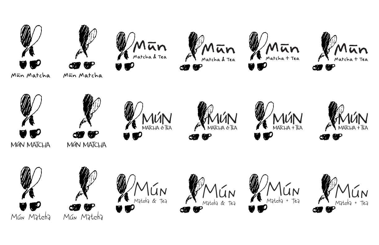
I sketched multiple designs for the brand focusing on key words that represented the brand, community, culture, and simplicity. WIth these key words, I physically sketched out logo designs and images traced them and began developing them graphically. I also created type variations where I focused on type faces that connected to the homemade aesthetic of the brand.
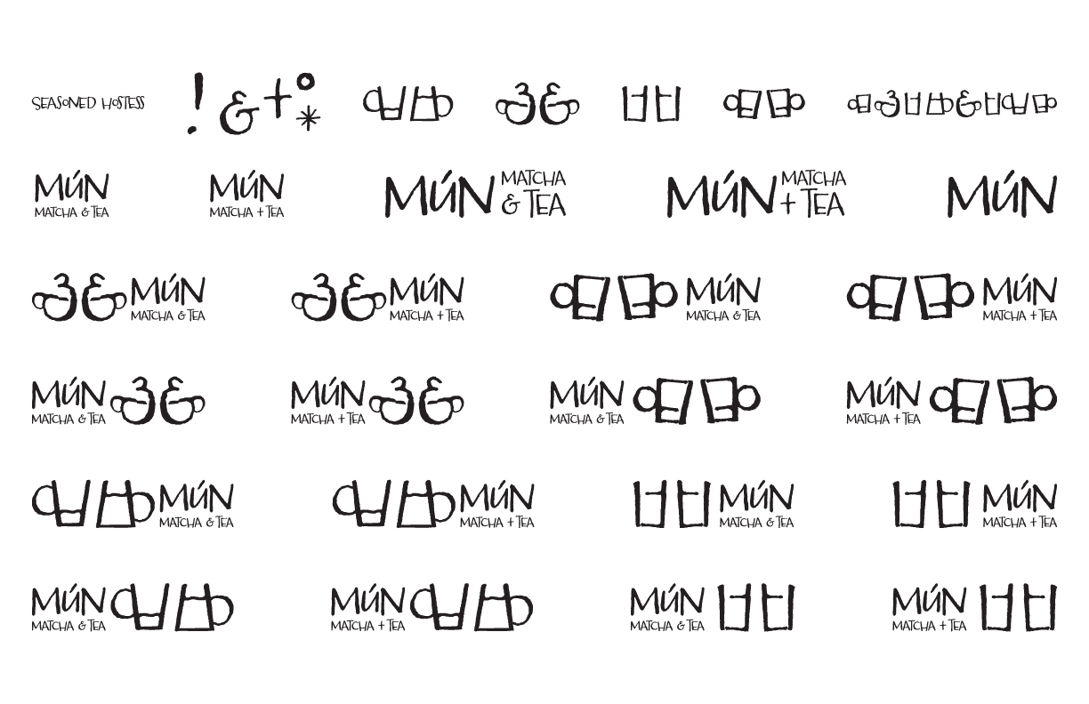
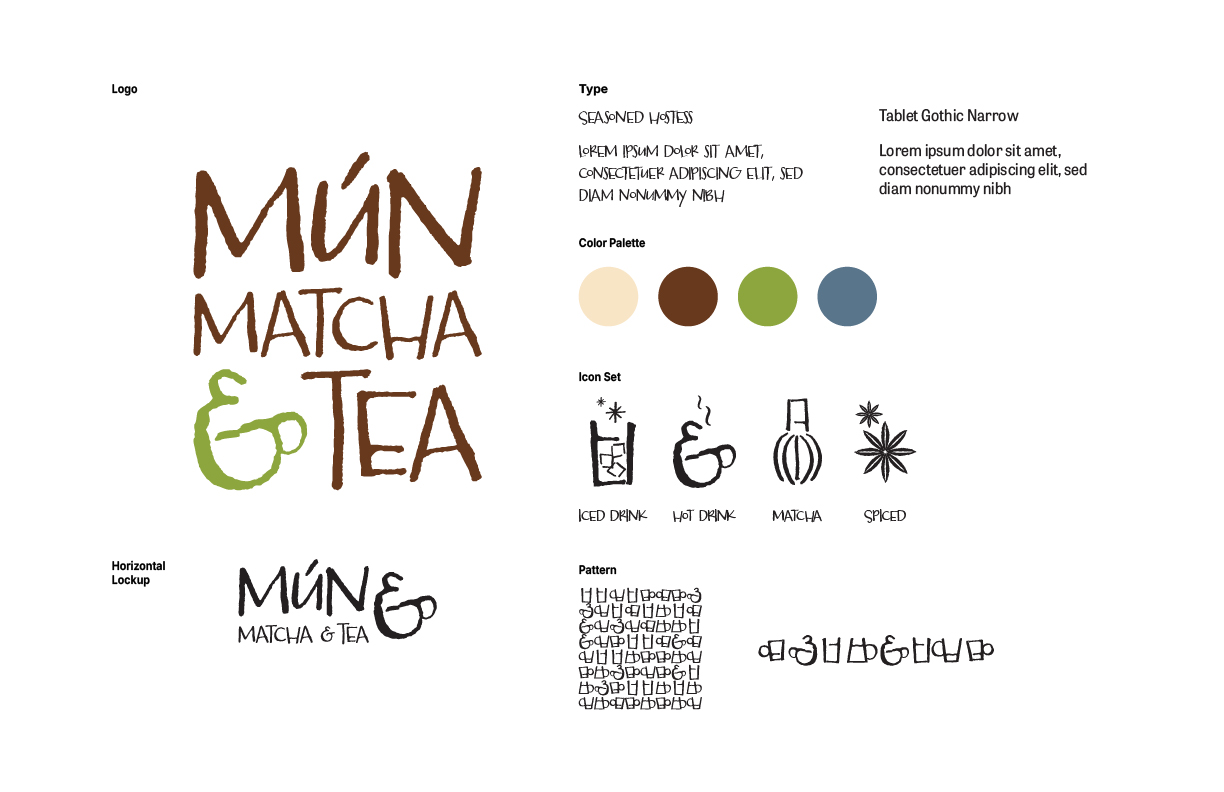
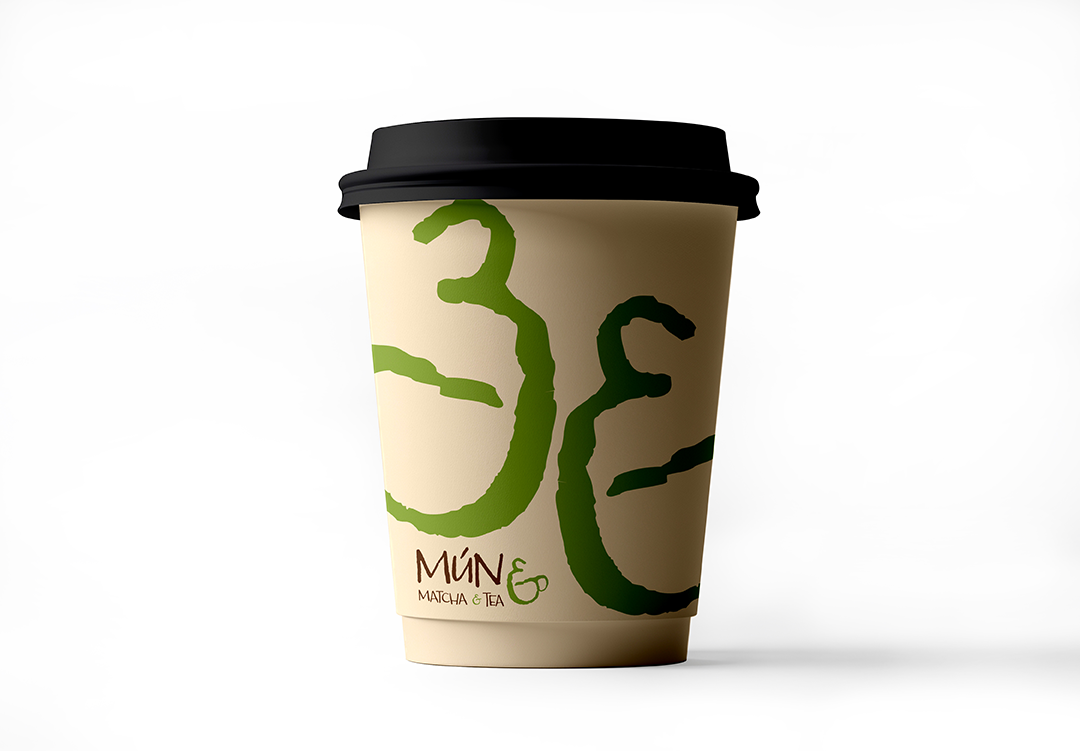
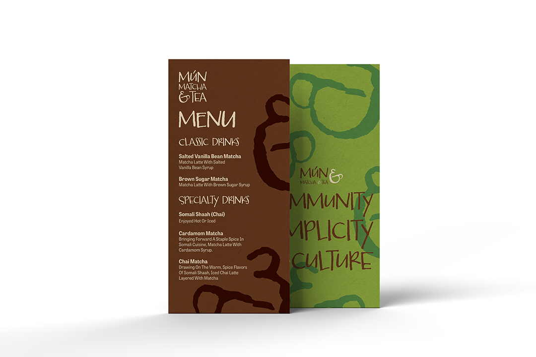
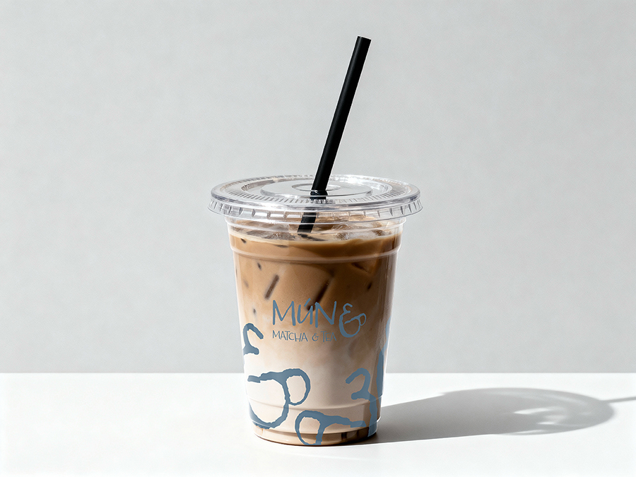
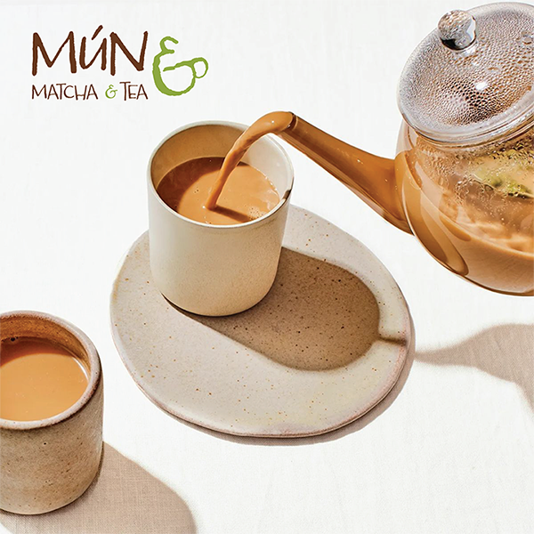
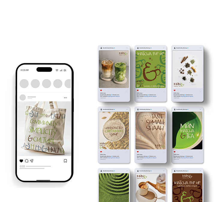
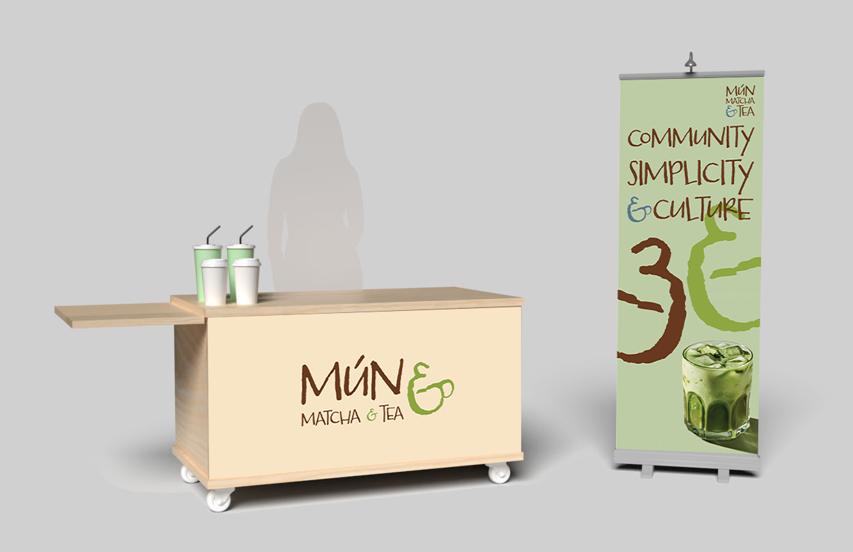
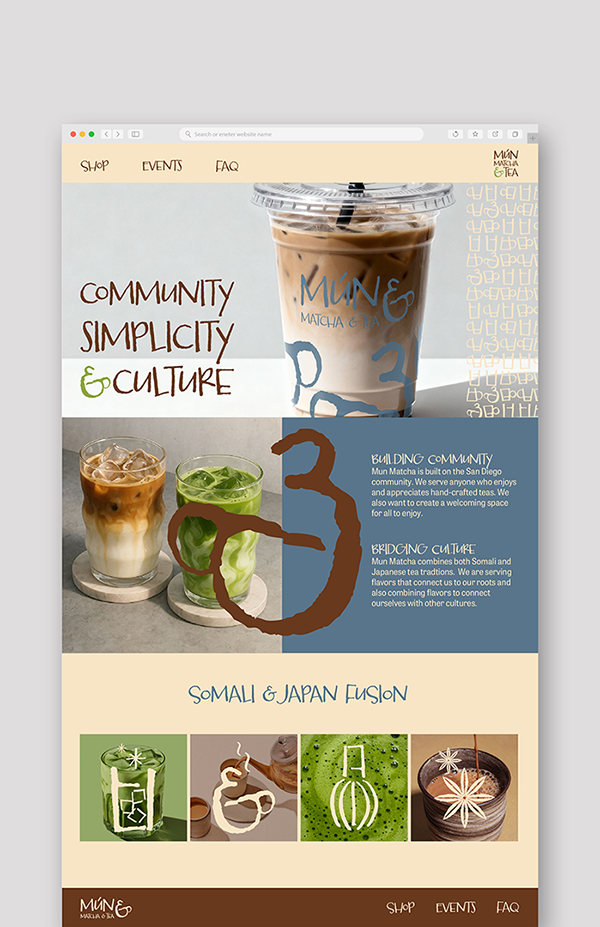
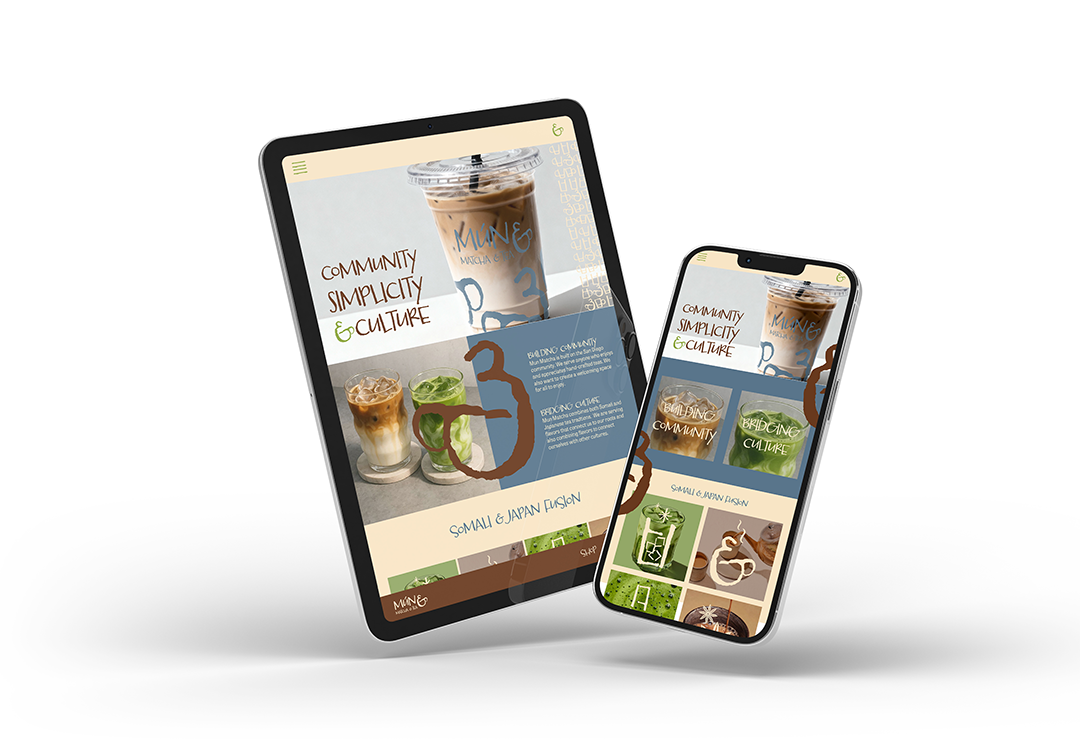
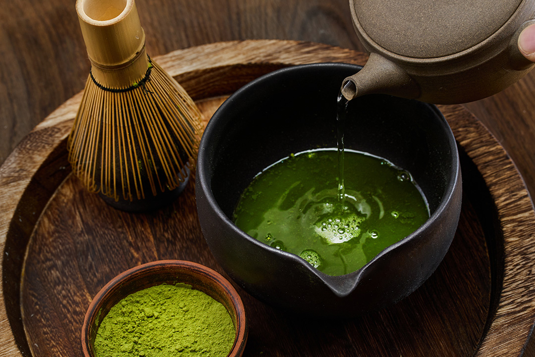
For the branding of Mun Matcha, I aimed to communicate the handcrafted nature of the product into the logo by using a hand drawn typeface. With the typeface, I created the steaming, hot cup icon from the typeface’s ampersand. I then combined this icon with “Mun Matcha and Tea” and used the cup icon to function as the ampersand. I used the chosen typeface to guide the design of the icons and pattern for a cohesive system. I used letterforms from the typeface to create the cups in the pattern and other icons. I chose a color palette that leaned more towards earth tones, I included a sandy, off white and subdued blue as a nod to the Somali coast, the dark brown for chai and the green for matcha. The icons, color palette, logo, and pattern are all used diversely throughout the deliverables. To show the utility of each design element as well as a cohesive system.