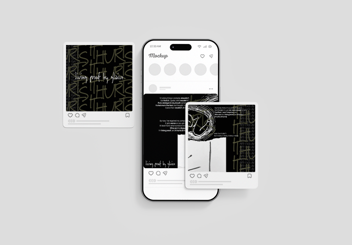
Project Overview
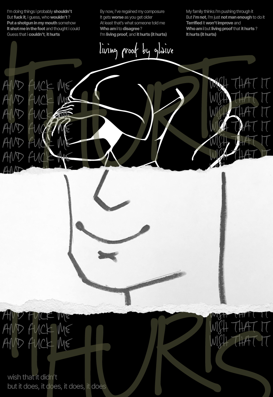
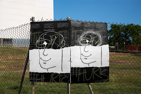
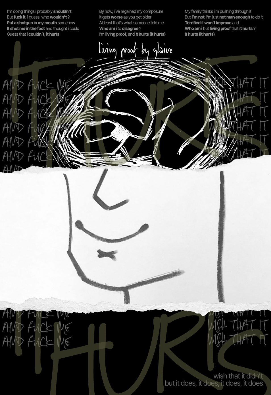
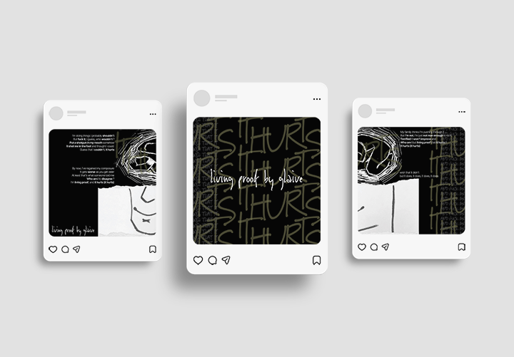
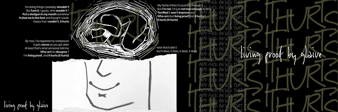
In this project, I explored how typography can elevate a song’s meaning to allow the viewer to experience the semantics of my song of choice. The image further adds meaning and interest. I explored both print and digital final deliverables. I focused on the strong emotions from the song “living proof (that it hurts)” by glaive, an artist who had multiple hyperpop albums before the EP, “a bit of a mad one” where “living proof” appeared. This song and EP felt different in emotions and depth in lyricism compared to the rest of his discography. This song especially was my favorite so I decided to use it to create a broadside that showed this emotion.
Process
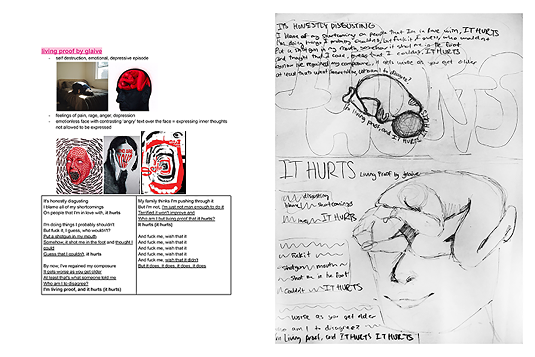
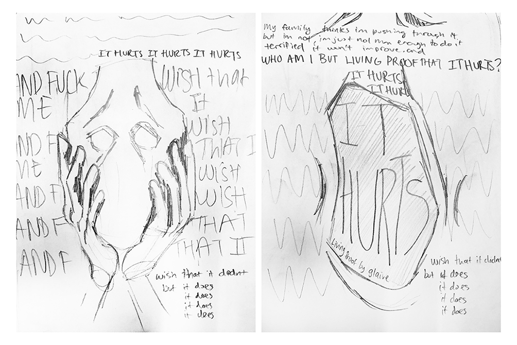
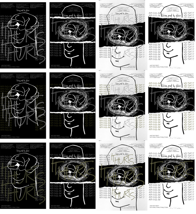
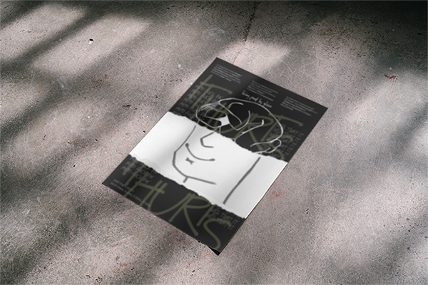
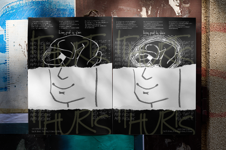
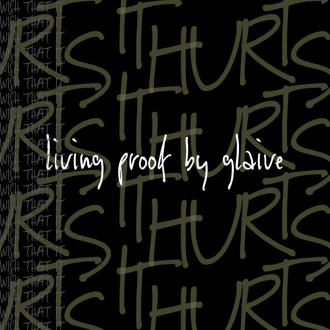
I began by researching aesthetics that I wanted to experiment with and also focusing on the emotions I wanted the viewers to experience. I focused on the key words, self-destruction, emotional, and depression. I also wanted to focus on the feelings of pain, rage/anger, and depression. I also wanted there to be a contrast between the depicted image and the typography, where the typography would be expressing the inner thoughts the song discusses that is not displayed in the image. I also looked into the lyrics of the song to find key phrases and verses that I wanted to highlight in the broadside and social media posts. I chose a handwritten typeface to continue in the trend of expressing inner thoughts through lyricism and I chose my color palette based off of a cover of “a bit of a mad one” and also green being the color for mental health awareness.