Project Overview
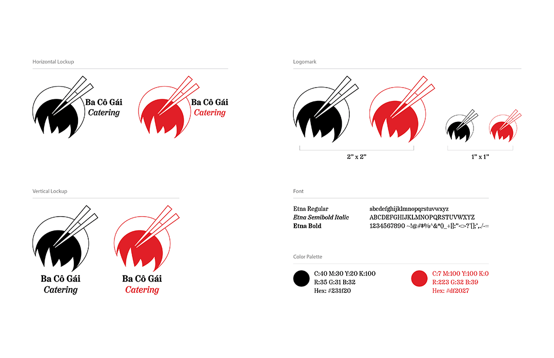
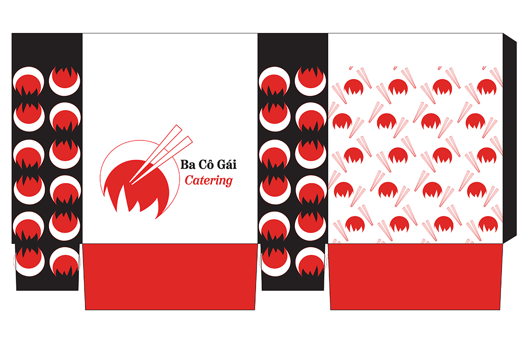
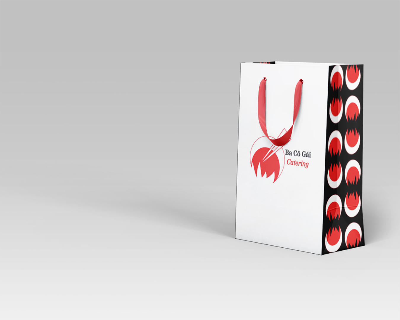
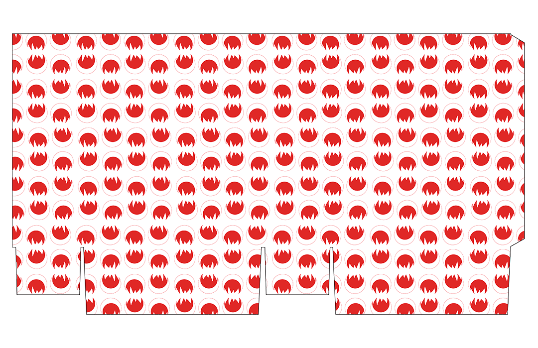
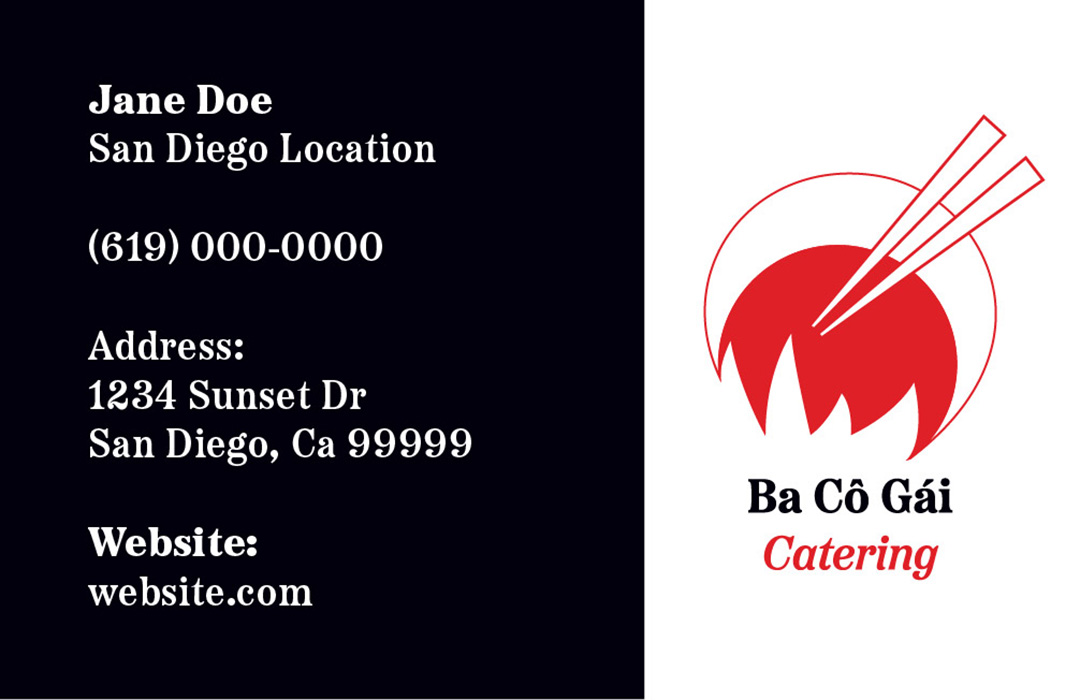
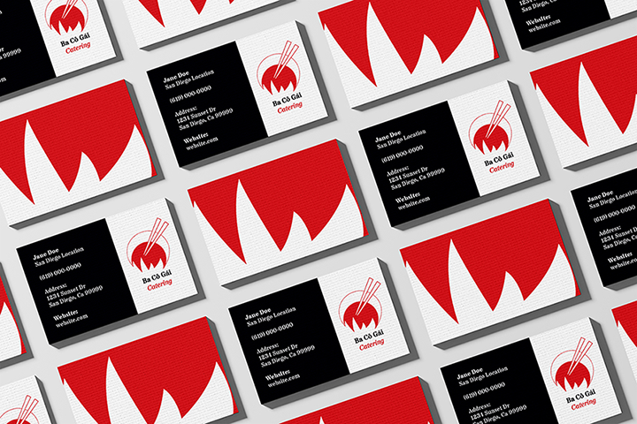
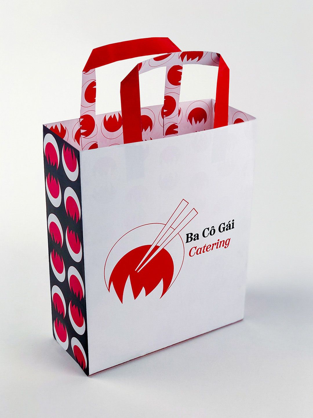
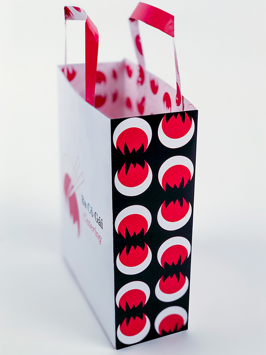
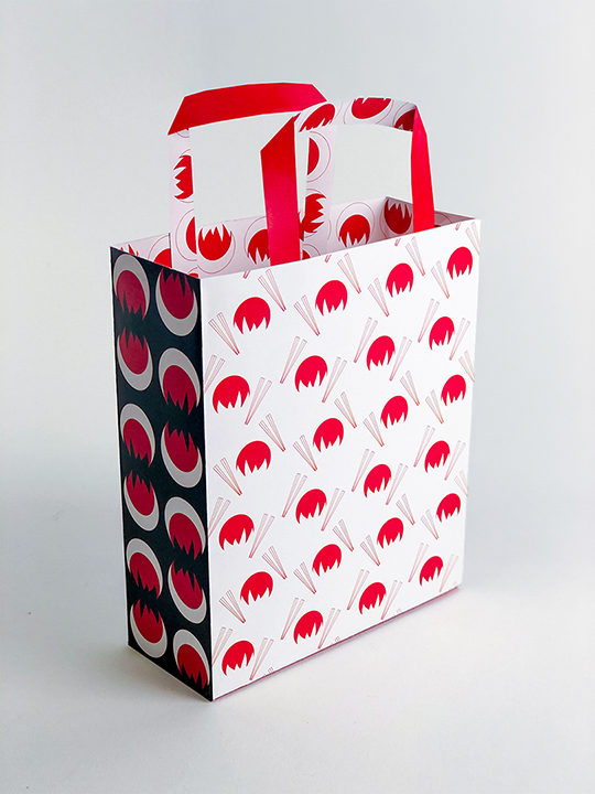
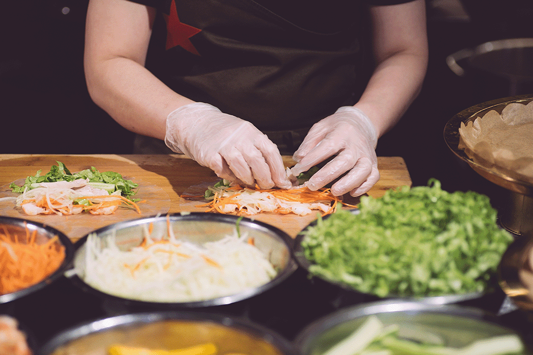
For this project, we explored abstract logo marks for possible businesses based off of key words describing said business. I chose to rebrand for Ba Co Gai Catering, a Vietnamese food catering business. Through research and symbol explorations, I was able to create a branding system based off of the logo and applied this mark to different assets such as, business cards, letterheads, envelopes, packaging.
Process
I began by choosing the key word, “cooking”. I sketched symbols that represented cooking and cooking Asian food. I chose images that represented my topic and chose a color palette based off of those images. The symbols I chose were the chopsticks, wok, and fire. The chopsticks are meant to represent both cooking and eating Vietnamese food, while the abstracted wok and fire represent the food being freshly made. The red and white colors are meant to mimic the classic red and white “Thank You” to-go bags common at Asian restaurants. The red also represents the flames associated with cooking and a small nod to the Vietnamese flag.